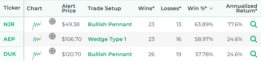
Free Chart Pattern Scanner
Stock Market Guides is not a financial advisor. Our content is strictly educational and should not be considered financial advice.
This is a free scanner that finds stocks exhibiting popular stock chart patterns.
As of June 11, 2026 at 1:16am Eastern Time
*Wins, Losses, Win Percentage, and Annualized Return are referring to how the stock performed in backtests for the Trade Setup indicated.
How to Use Our Free Chart Pattern Scanner
The above list represents stocks that have popular chart patterns today.
It's powered by our proprietary stock scanner, which searches once per day for stocks that have these patterns.
You can sort columns using the up and down arrows next to the column name. You can add filters for the column values by clicking the "Add Filter" button above the list of stocks. This scanner is designed for active stock traders.
This video shows how to use our scanner:
Scanner Features that Require a Subscription
Our free scanner offers you the ability to find stocks that have popular chart patterns, but you may need more than that to ensure you're making trades that have a true edge.
Our paid Swing Trading Service includes scanner features that are designed to offer you all the intelligence our research can offer. These are the scanner features you get if you pay for a subscription:
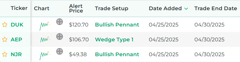
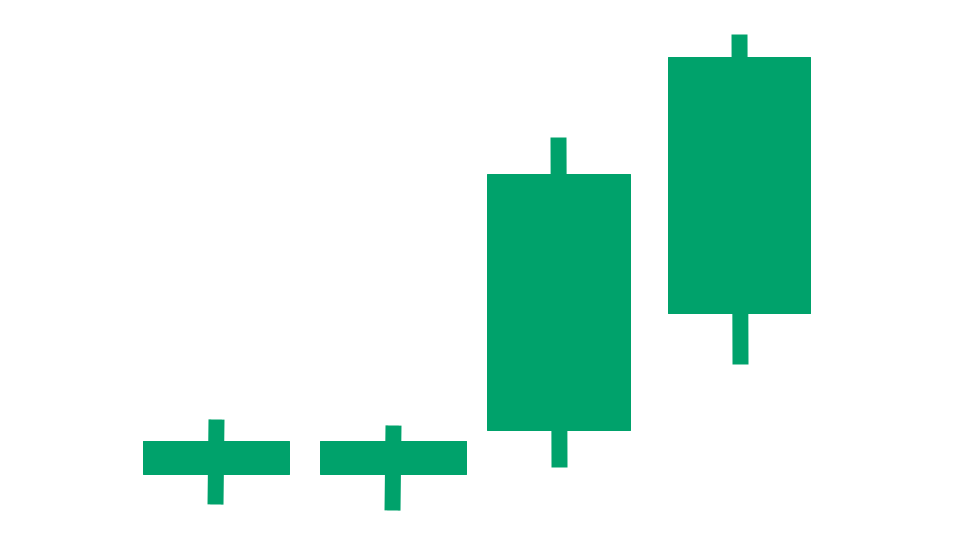
- See the historical backtested performance for each scan result. It looks like this:
- See full trade setups for each scan result, including when to enter and exit. It looks like this:
- Get alerted when there are new scan results (by text or email).
- Get access to real-time scan updates throughout the trading day.
- Access scan results for all trading strategies in a single scan to easily see which trade setups have the best backtested performance across the entire market at any given time.
- Get access to scan results for our proprietary trading strategies, which required years of research to develop.
- Find Stock Trade Setups That Have a Backtested Edge
- Has DIY Swing Trading Scanner
- Get Swing Trade Picks from Our Scanner: 79.4% Average Annualized Return in Backtests
Here's a video that explains the difference between our free chart patterns scanner and the scanner from our paid service:
Stock Market Guides
Stock Market Guides identifies swing trading opportunities that have a historical track record of profitability in backtests.
Average Annualized Return
79.4%
Which Chart Patterns Are Included In Our Scanner?
The follow popular chart patterns are ones that are included in the above scanner:
Ascending Triangle
An ascending triangle is a stock chart pattern characterized by two trendlines. One is a horizontal line along the top made up of price peaks, which serves as a resistance level. The other is an upward sloping line of support at the bottom that connects the price troughs.
That image is a graphical icon that gives an idea visually of what an ascending triangle chart pattern looks like.
Bull Flag
A bull flag is a stock chart pattern characterized by three trend lines.
The first trend line is on the left side of the pattern and is typically a steep upward sloping line. This is considered the "flagpole" of the bull flag pattern.
The other two trendlines serve as the "flag". They run parallel to each other to form the shape of a rectangle with its right side tilted downward.
The top flag trendline is a downward sloping line of resistance that connects the price peaks. The bottom flag trendline is a downward sloping line of support along the bottom that connects the price troughs.
The rectangular flag pattern connects to the top of the flagpole in a bull flag.
That image is a graphical icon that gives an idea visually of what a bull flag chart pattern looks like.
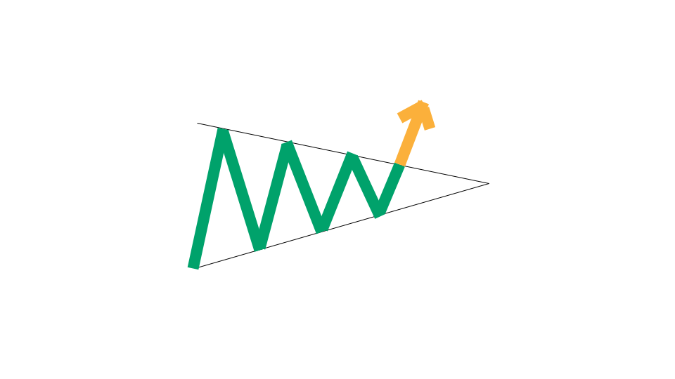
Bullish Pennant
A bullish pennant is a stock chart pattern characterized by three trend lines.
The first trend line is on the left side of the pattern and is typically a steep upward sloping line. This is considered the "flagpole" of the bullish pennant pattern.
The other two trendlines serve as the "flag". They converge to form the shape of a sideways triangle. One is a downward sloping line of resistance along the top that connects the price peaks. The other is an upward sloping line of support along the bottom that connects the price troughs.
The triangular flag pattern connects to the top of the flagpole trendline in a bullish pennant.

That image is a graphical icon that gives an idea visually of what a bullish pennant chart pattern looks like.
Channel Pattern
A range is the same thing as a channel pattern. Those two terms mean the same thing.
A range is a stock chart pattern characterized by two trend lines. One is a horizontal line along the top made up of price peaks, which serves as a resistance level. The other is a horizontal line of support at the bottom that connects the price troughs.
That image is a graphical icon that gives an idea visually of what a channel chart pattern looks like. You can see how the two trendlines run parallel to each other.
Cup and Handle
A cup and handle refers to a type of chart pattern. Imagine looking at a stock chart and seeing a pattern that looks like a tea cup with a rounded bottom and a spout-like handle. In trading terms, it looks like this:
Cup Part: The left side of the pattern has a decline in price, then reaches a low point (like the bottom of the cup), and then begins to rise back up roughly the same amount as it declined.
Handle Part: After the cup is formed, a cup and handle pattern is completed when there is a much smaller price decline followed by another price increase.
There are therefore at least two troughs on a cup and handle pattern: the big one from the cup and the small one from the handle.
The high points of both the cup and handle would typically form a relatively straight horizontal line. This might be thought of as a resistance level.
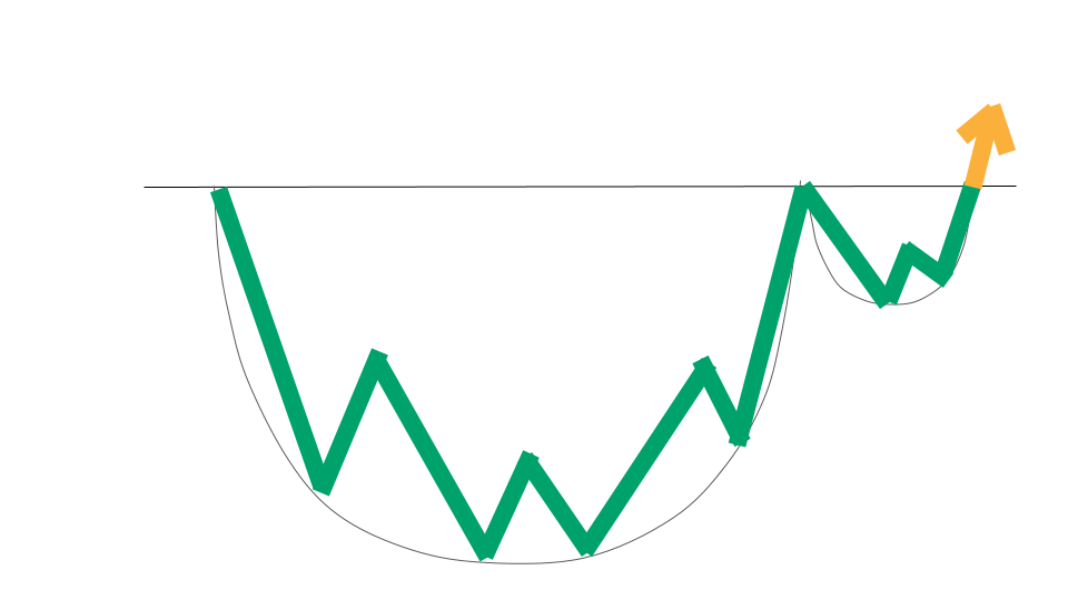
That image is a graphical icon that gives an idea visually of what a cup and handle chart pattern looks like.
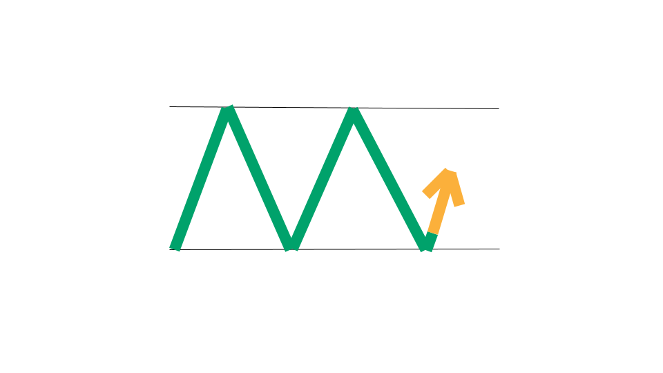
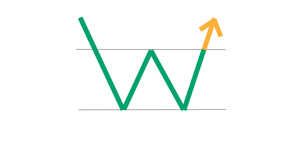
Double Bottom
A double bottom is a type of chart pattern that occurs after a downtrend in price and is characterized by a stock chart having two consecutive troughs at approximately the same price level. That price level is referred to as a support level.
When you look at it on a stock chart, a double bottom looks like the letter "W". The price bars are patterned in such a way that there are two troughs with a peak in the middle.

That image is a graphical icon that gives an idea visually of what a double bottom chart pattern looks like.
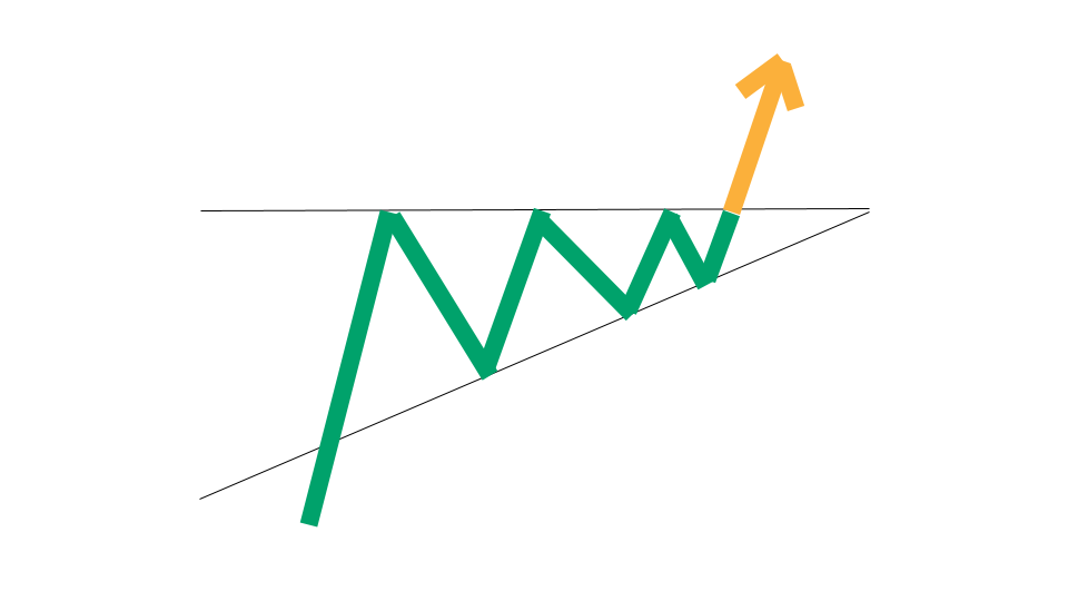
Falling Wedge
A falling wedge is a stock chart pattern characterized by two trendlines that converge to form the shape of a falling wedge. One is a downward sloping line of resistance along the top that connects the price peaks. The other is an upward sloping line of support along the bottom that connects the price troughs.
The upper and lower lines of the falling wedge pattern are not symmetrical. The upper line has a steeper slope than the lower line, so it has the appearance of an asymmetrical wedge that leans downward.
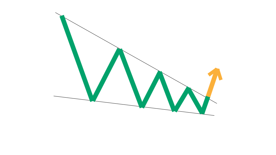
That image is a graphical icon that gives an idea visually of what a falling wedge chart pattern looks like.
Inverse Head and Shoulders
An inverse head and shoulders pattern is characterized by a stock chart having three consecutive troughs, where the middle trough (the second one) has a lower price than the other two troughs on either side of it.
In between the troughs are two price peaks. One of the price peaks is between the first and second troughs, and the other price peak is between the second and third troughs.
When you look at it on a stock chart, an inverse head and shoulders looks a bit like a drawing of a head and two shoulders, except upside down. The head is the lowest price trough in the middle, while the shoulders are the first and third troughs, respectively.
Some people might refer to this pattern as an inverted head and shoulders. Both terms mean the same thing and are referring to the same chart pattern.
That image is a graphical icon that gives an idea visually of what an inverse head and shoulders chart pattern looks like.
Support Level
A support level in stocks refers to a specific price level on a stock chart where the stock's price tends to find buying interest and prevents the price from falling further. It is also known as a "swing low."
In other words, it's a point where the stock's price has stopped decreasing and starts to bounce back up.
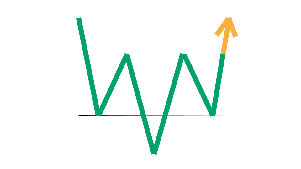
Triple Bottom
A triple bottom is a type of chart pattern. A triple bottom occurs after a downtrend in price and is characterized by a stock chart having three consecutive troughs at approximately the same price level. That price level is referred to as a support level.
When you look at it on a stock chart, a triple bottom looks like the letter "W", but with one extra "v" wedged in the middle. The price bars are patterned in such a way that there are three troughs with two price peaks in the middle.
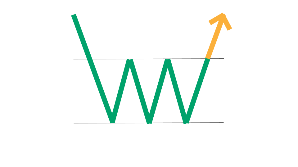
That image is a graphical icon that gives an idea visually of what a triple bottom chart pattern looks like.
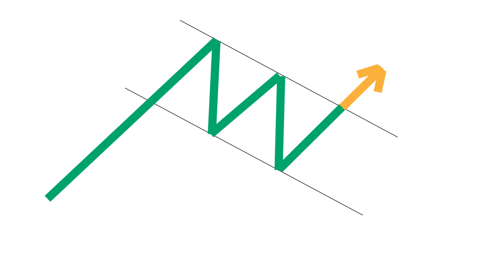
Wedge
A wedge is a stock chart pattern characterized by two trendlines that converge to form the shape of a wedge. One is a downward sloping line of resistance along the top that connects the price peaks. The other is an upward sloping line of support along the bottom that connects the price troughs.
That image is a graphical icon that gives an idea visually of what a wedge chart pattern looks like.
How We Find Stock Chart Patterns Each Day
Our one-of-a-kind scanning technology is at the heart of everything we do here. We have a way to define popular stock chart patterns in our scanner, and then it uses real-time data feeds to find any stocks that meet those criteria.
Learn More at Stock Market Guides
Want to learn other popular indicators, chart patterns, and candlestick patterns? Check them out here:

Have Questions About Chart Patterns or About Our Services?
If you have questions about stock chart patterns or questions about any services we offer, you can contact us any time and we'll be ready to help.
Join Our Free Email List
Get emails from us about ways to potentially make money in the stock market.
Stock Market Guides
You can trade without an edge, but why?
What We Offer
Stock Market Guides identifies swing trading opportunities that have a historical track record of profitability in backtests.
Average Annualized Return
79.4%